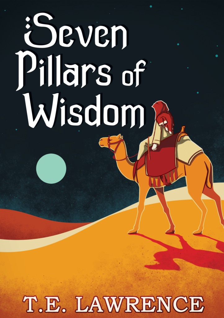
This was a project to redesign an existing book cover. I picked Seven Pillars of Wisdom by T. E. Lawrence. My goal for this project was to focus on the color palette and typography. For the colors I wanted something that would stand out on a bookshelf but still fit the aesthetics of the story so I landed on a complimentary blue and orange palette with some lighter shades thrown in for extra contrast. This was my first time doing fully custom typography and I pulled a lot of inspiration from existing fonts. particularly brush stroke fonts to give it an older and handmade feel I thought fitting for a memoir.
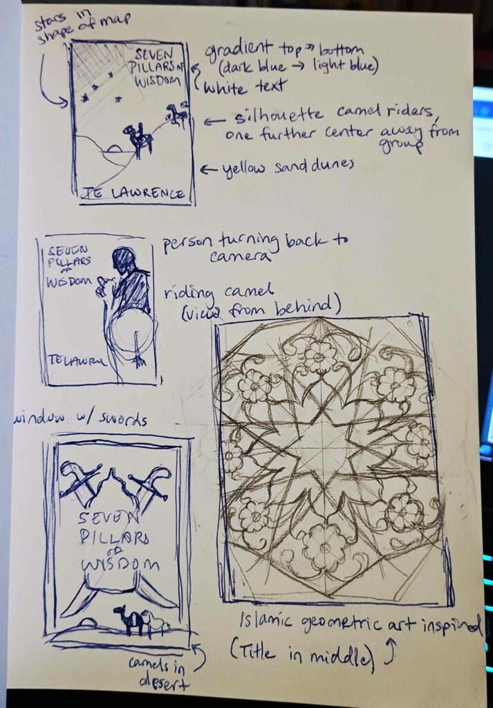
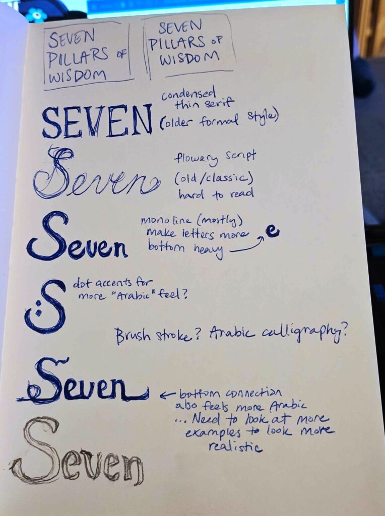
I did several sketches of the cover design before selecting one to finalize. Even though I had the original idea early on and was fairly confident that was the one I wanted to move forward with, I wanted to explore other options while in the sketch phase as well. The typography took longer to decide on as I knew some general characteristics I wanted to convey but had to try out several options before landing on one. The type should feel older, as it is a historical text, but still personal and with a regional aesthetic since the locations are very important to the story itself. I decided on an accented brushstroke font made from scratch to capture all of these aspects.
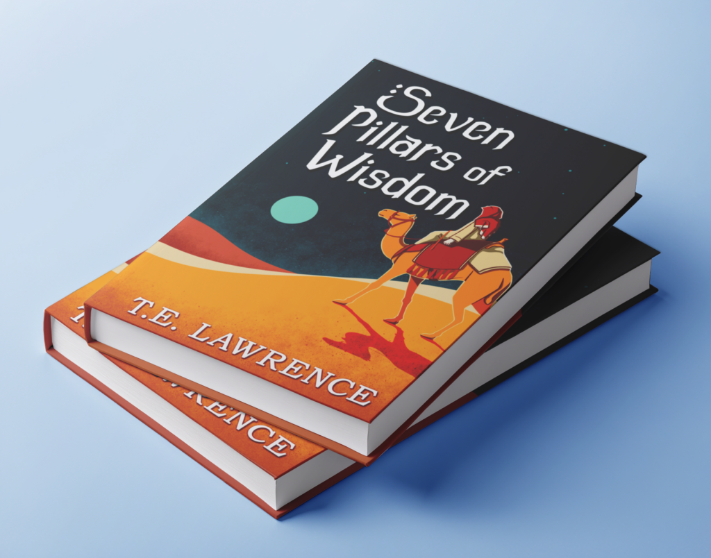
This is the final design of the cover. Overall, I think I was successful in my general color choices and the use of colored texture layers to blend the colors of the piece together making it a cohesive whole. The font has a high degree of readability with the strong contrast between it and the background color. One area where I could improve would be to make the kerning between the letters more consistent to give the title a more polished look, but I feel I was successful in conveying the emotions I wanted to capture through the typeface.