I was tasked with creating a logo and redesigning the website for the Tagata Moana Hui Foundation using their existing Wix builder framework. I kept their existing pages but changed the layout, theme colors, and fonts to make them more consistent across the website and more fitting to the brand’s image.
Creating the logo for the Tagata Moana Hui Foundation had an extended drafting phase where we initially discussed the purpose of the foundation and what they do. TMHF is a collective of health workers who partner with other organizations to connect resources and coordinate events with the community.

These are the very first sketches I did. The first being based on traditional Hawaiian quilting patterns, specifically the ulu fruit leaf which is both recognizable and means prosperity. I picked a blue color for the association with health organizations, often symbolizing trust and reliability. The second design is inspired by the honi, a traditional Hawaiian greeting. And the third is a hibiscus flower, a common logo image for local organizations
After more discussion, we instead went with a Tanoa, or kava bowl, to symbolize gathering and community as well as an ‘ula fala, a lei symbolizing honor and leadership. The hibiscus were also included to show the cross cultural connections between multiple Polynesian cultures.
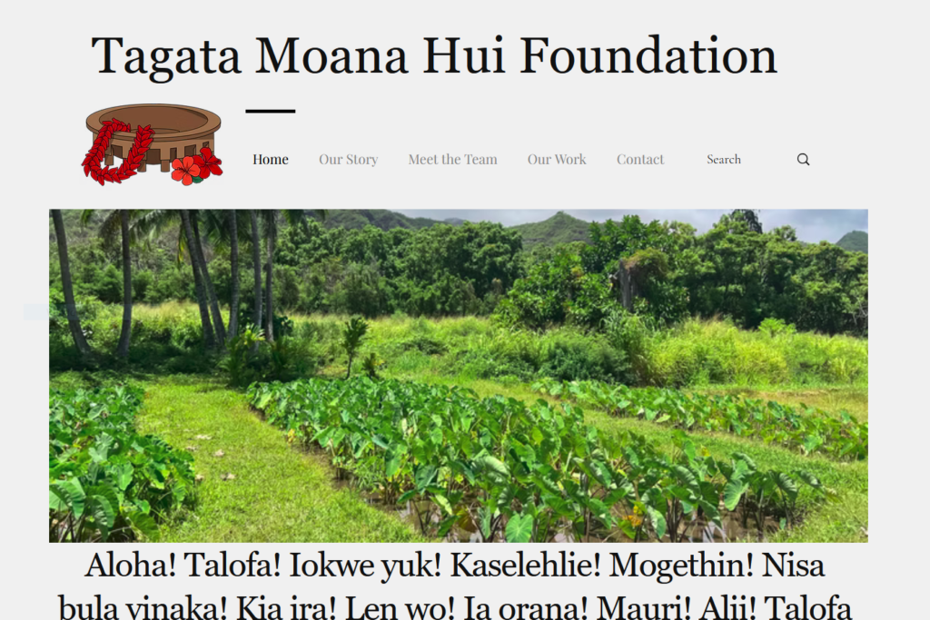
These are images of the original Home page, Meet the Team Page, About page, and Contact form.
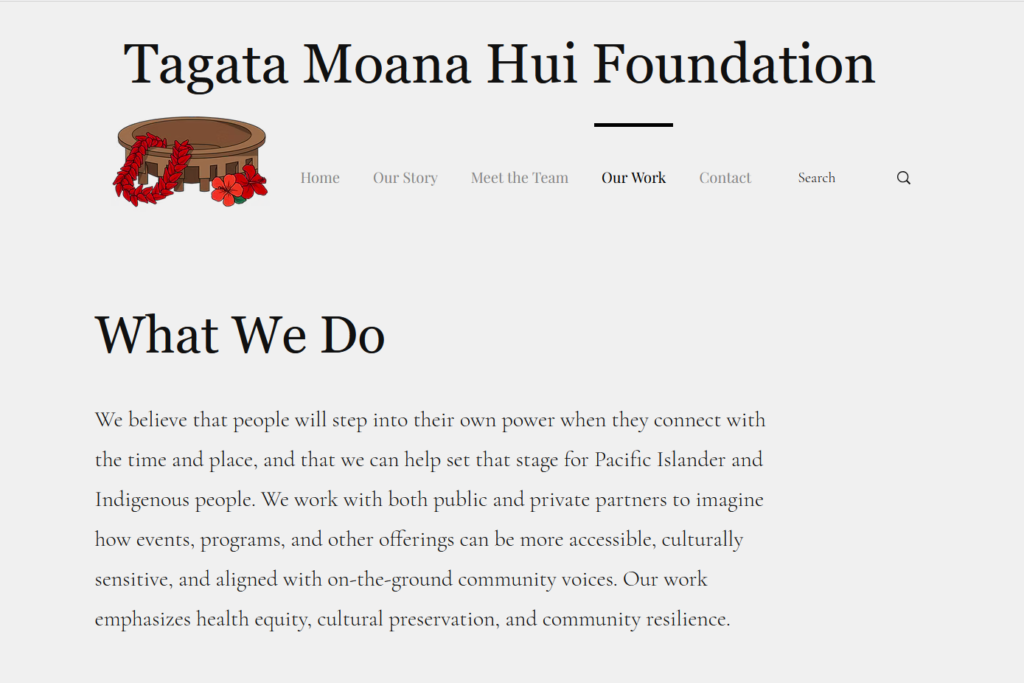
I wanted to pick a color scheme that would fit Tagata Moana Hui’s image as trustworthy and community focused. I chose a natural palette with a lot of greens and browns since these colors are often associated with health and TMHF is a health and wellness focused organization. I also went with a serif body text to give TMHF an established and trustworthy vibe.

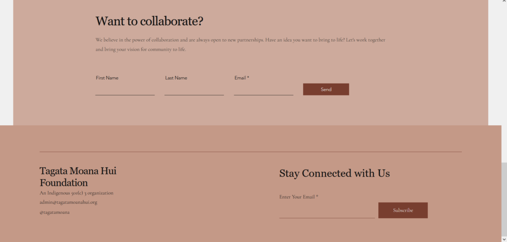
I decided to vary the page layouts and intersperse them with a lot of visual elements to make them more visually interesting. I also changed the contact form from a separate page to a footer on the bottom of each page for a more easily accessible call to action.
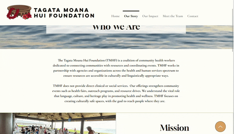

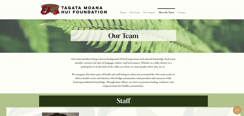
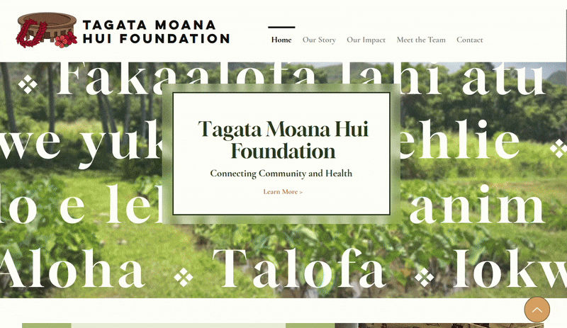
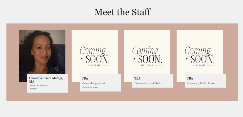
I liked how the original home page had greetings from several Polynesian languages since that fits well with TMHF’s mission of cross cultural collaboration, so I added that as an animated scroll over a background image to be less intrusive and space intensive while still being noticeable and a key part of the home page. I changed the Meet the Team page so it was separated by staff and board members and changed the placeholder image to the Foundation’s logo.
The TMHF website had also been getting subscribers that they weren’t sure how to handle and hadn’t been utilizing, so I added a small section for recent posts that could be used like a newsletter and update any subscribers on recent or upcoming events TMHF is involved in.