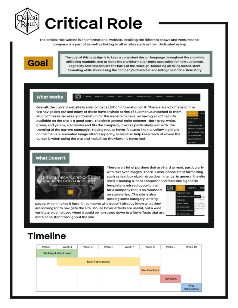
This project was an exercise in taking an existing website and redesigning it to improve user experience and usability while maintaining the company’s branding and site functions. For this, I chose the Critical Role website at https://critrole.com/ where I made redesigns of the Home page, two key pages (Live Events and Shows), and the specific page for Campaign 4 that could be used as a template for all of the other campaign and show pages.
Looking at the existing site, there are several things that stood out that I wanted to improve upon in my redesign. There are areas where text is difficult to read when placed over images, there’s places where formatting like the size of drop-down menus are inconsistent, and the website’s site map is confusing with some pages hidden and only accessible in the footer or seemingly missing key pages.
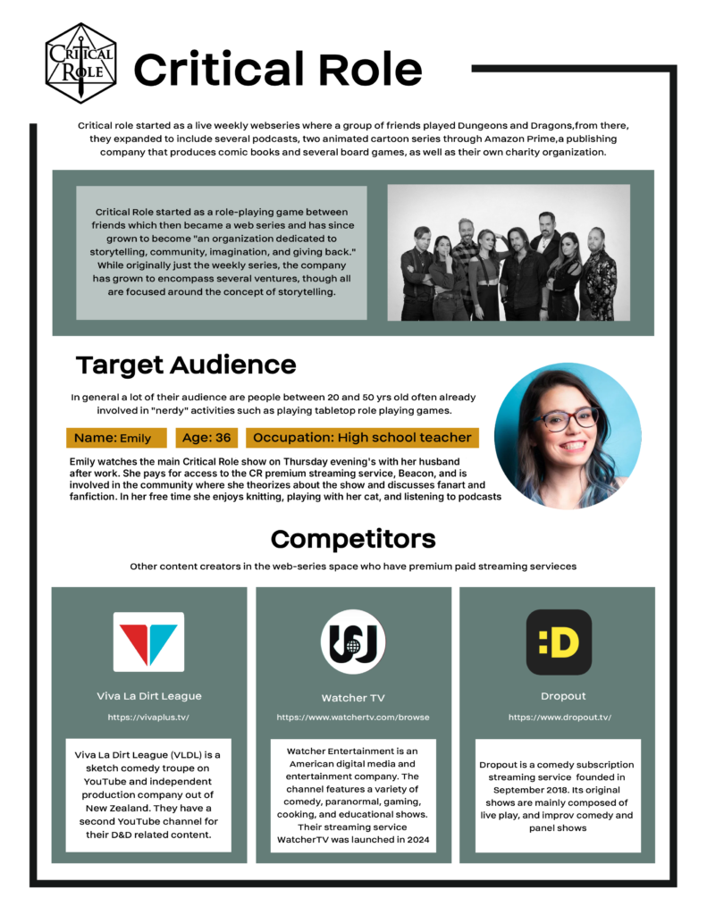
I started with making a creative brief for the project, I included a quick summary of the company and some description taken from their “About” section to get at the heart of how Critical Role presents themselves. I added a target audience profile to give an example of what someone who will use the website might be like, as well as some competitors who are also in the space of web visual content creators with premium paid services. The goal of the project was to create a visually consistent website within the allotted time frame.
Site Map
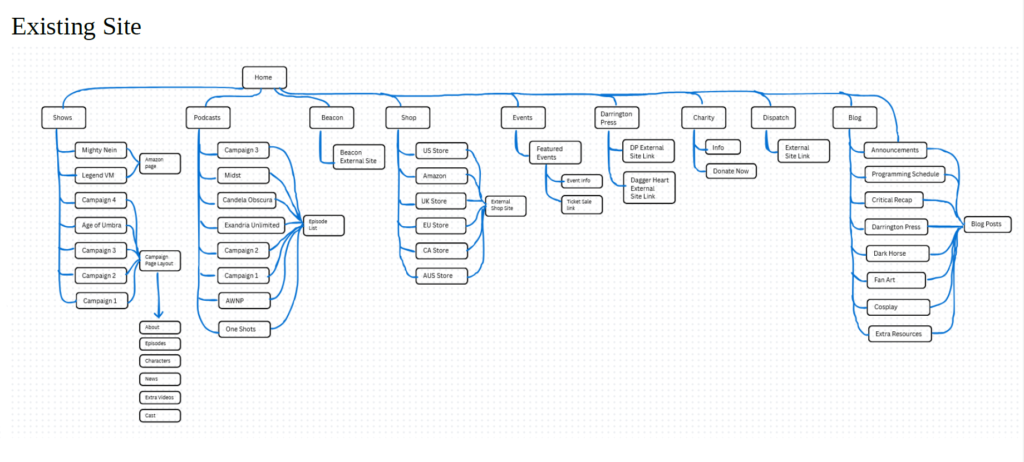
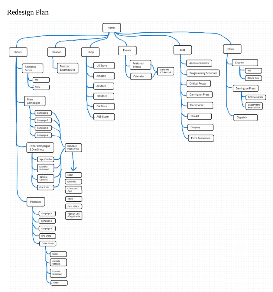
I made a site map for the original site, this was to get an idea of how the site is laid out as well as to keep track of the information on the site. In my redesign, I decided to cut down on the breadth of the site, instead making the navigation deeper. I did this to minimize the number of categories on the navigation bar to make it less overwhelming to people who may not be familiar with what Critical Role is, as well as to cut down on some redundancy, such as including podcasts under shows instead of having its own tab.
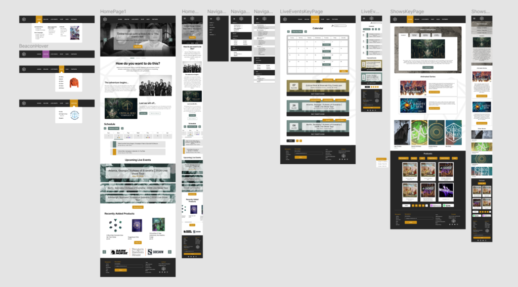
Home Page
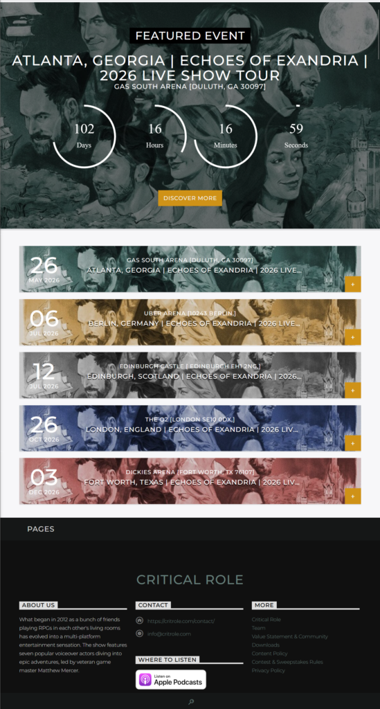
This is my redesigned homepage. I kept the banner at the top with recent blog posts since those generally serve as the recent announcements, though I added a white rectangle behind the text to make it more readable over the image. The page flow while scrolling down is announcements → about us → schedule/events → shop/business partners. I put the about at the top since that is where new people who don’t know about the show would look for info, versus people that know what they are looking for would just go straight to the navigation bar.
I put a weekly calendar and some upcoming events next since that’s often what people who are familiar with the show are looking for, so people who don’t want to click away to the specific page could find the info by scrolling. I again adding some background to the text for readability. The shop is at the end as a sort of call-to-action and so it is easy to access from the top navigation bar or bottom of the page. I added a newsletter signup to the footer since I know the website has one, but couldn’t find a link to it anywhere. I kept all of the elements of the home page in the mobile version but changed most to a center column orientation that is more mobile friendly, rather than multiple columns or right/left aligned.
Navigation Menus
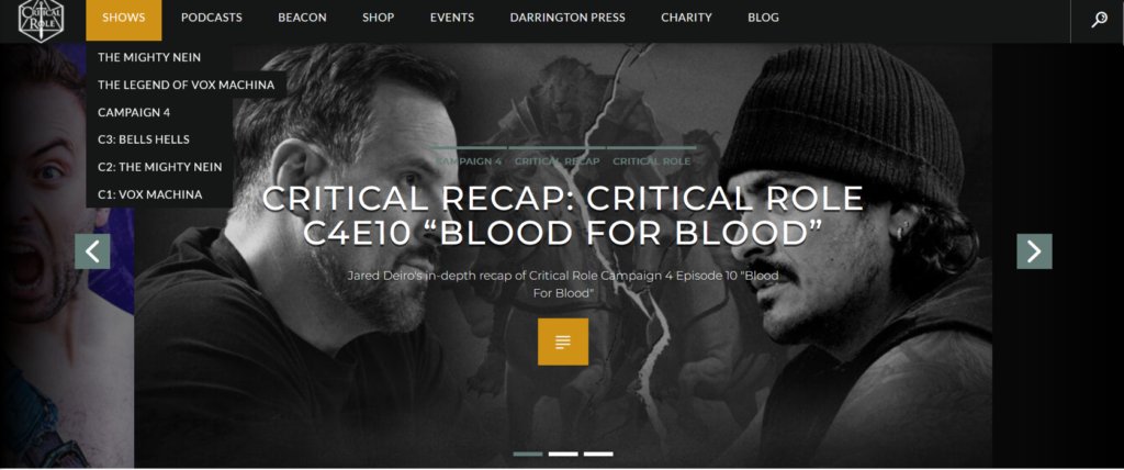
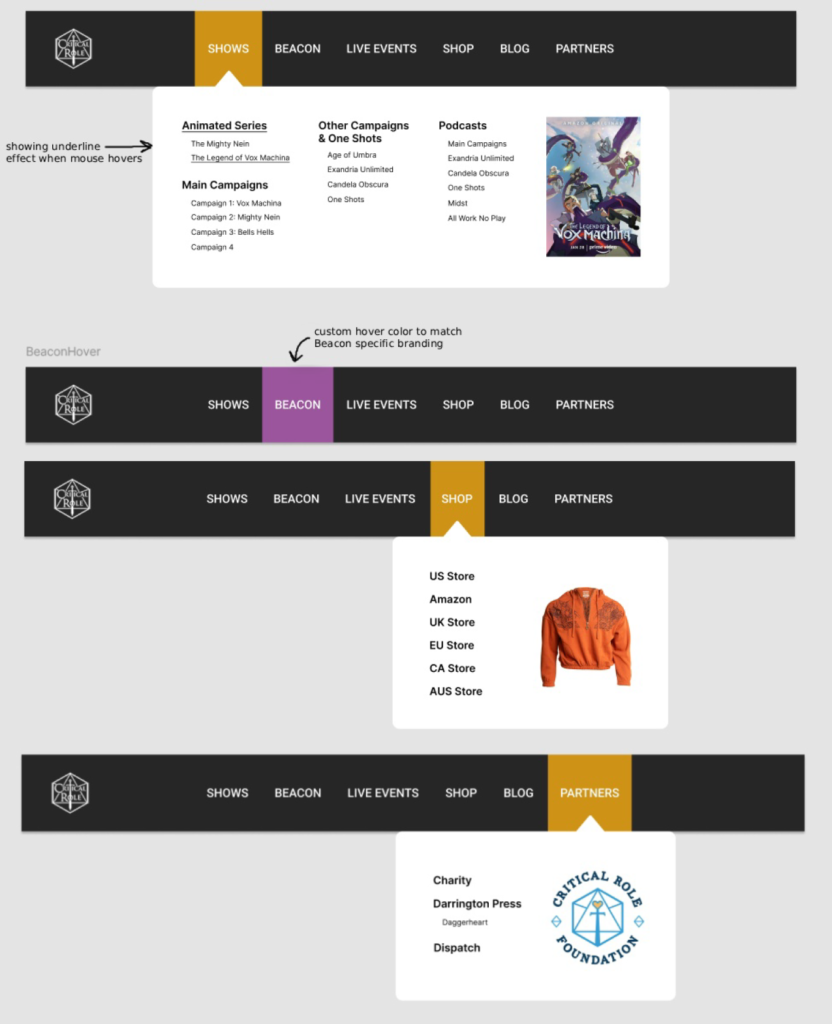
The next task was to design the navigation menus. Because there were so many key pages/categories and sub categories, I decided to go for a mega-menu with everything shown on desktop (versus a nested menu) to keep it simple to navigate. For readability, I added a changing background color to the category on mouse hover, as well as the arrow at the top of the menu box to help keep position. In my mock up I also included an example of underlined menu text as an example of what hovering over the menu category would look like. The Beacon category got a unique hover color because it is Critical Role’s premium paid service, so this draws attention to it, as well as matching the Beacon specific branding colors (purple and white)
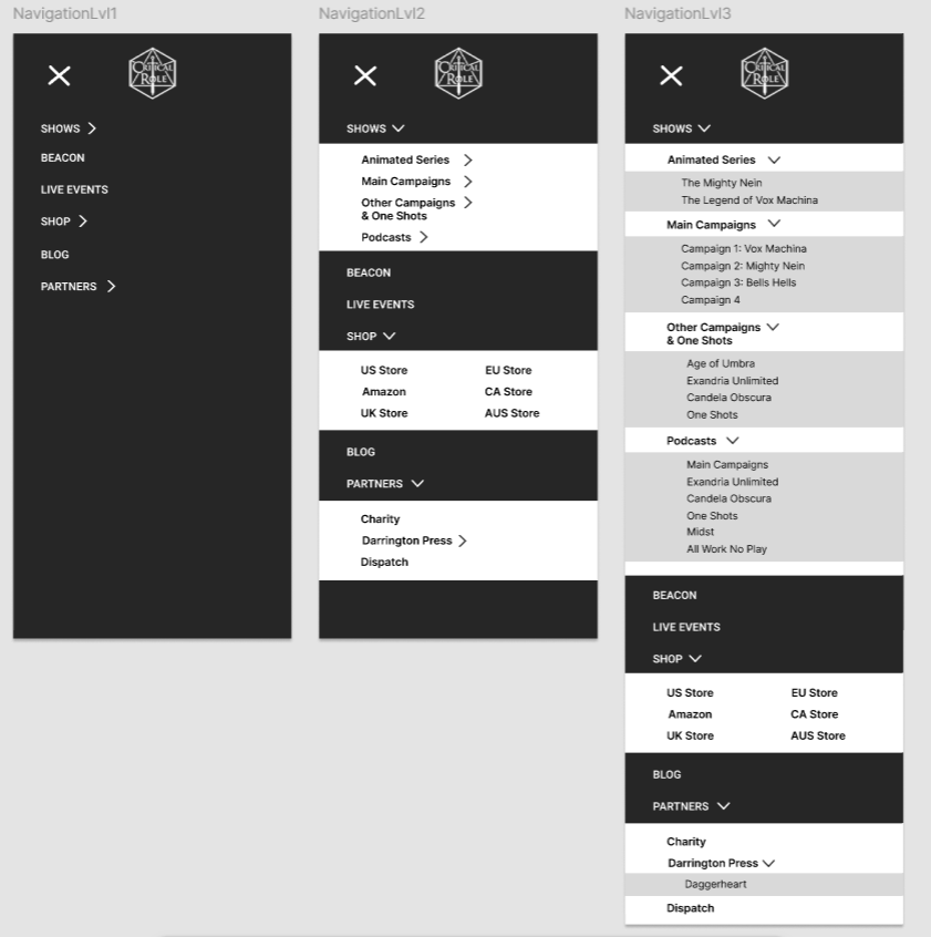
I went with a hamburger menu for mobile, since there would be too many categories for a traditional menu on a small mobile screen. I went with a full screen expanding menu that have toggle-able sub menus. Because there are so many categories, the full screen menu would be less cluttered and visually jarring with the sub menus opening and closing, it also allowed me to keep all of the pages and categories without cutting anything on the mobile version of the site.
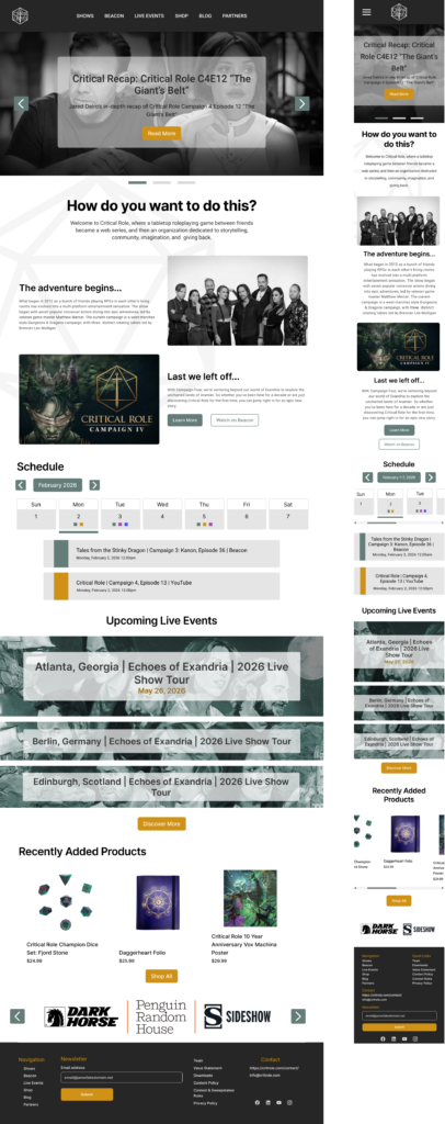
Live Events Key Page
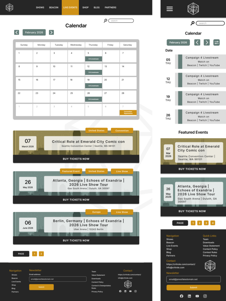
I also designed the “Live Events” key page. The current page (shown on the left) has five banners for upcoming events, the one coming up the soonest has a countdown timer on the banner, and there is a button on the bottom right corner to open a page with more information about the event.
In the redesigned page (desktop version center, mobile on the right), I added a calendar for a quick overview of events and to scroll through quickly if there were a lot coming up. I also noticed that the existing page (left image) is missing convention appearances, so I added them as part of the events page as well as making a more obvious tagging system on the top right of each banner to quickly sort by country or if the event is a convention appearance or live show, as well as differentiating the two by the color of the image background. Instead of having only a small clickable button in the corner, these banners would have the entire image area be clickable (with underlined text on hover) that would lead to the specific event information page, as well as the “buy tickets now” button on the bottom that would lead directly to the ticket purchasing website.
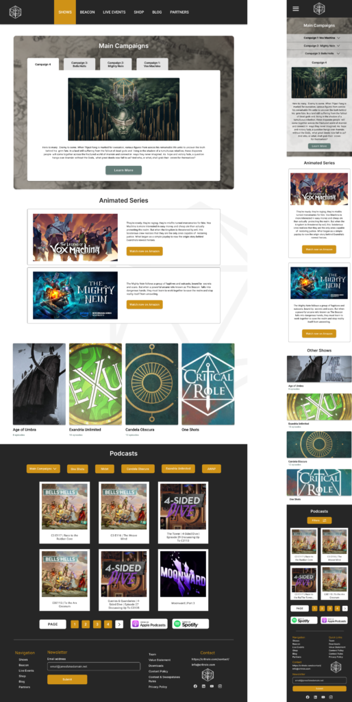
Shows Key Page
One of the things I felt the current website was missing is a Shows key page. Currently, clicking “Shows” on the navigation bar leads nowhere, and it is only used for the drop down menu. This felt like a missed opportunity especially for people who aren’t familiar with the many Critical Role Shows and might want to see an overview or at least an organized area displaying all of the things Critical Role does.
I decided on a tab menu (collapsible menu on mobile) for the main shows to save space while still showcasing related key art and to keep all of the main campaigns in a contained area. I stuck to the categories that are in the existing drop down menu while grouping them into categories (main, animated, other series) instead of having them all mixed together as in the existing menu. I also moved the podcast section here, under “Shows”, instead of having it be its own category, since most of the podcasts are audio only reuploads of the shows it made sense to link to them directly from the show pages instead of having to sift through them as an entirely separate thing.