The goal of this project was to create three product designs, a logo, and an accompanying motion graphic for the fictional iced coffee brand, Mojo. I created a 2.5 week schedule from pre-production to final presentation; including a phase for research and planning, sketching, and production of final assets. The goal of this project was to focus on typography and brand aesthetic as well as practicing my motion graphic skills and learning how to import 3D assets into After Effects.
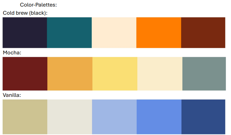
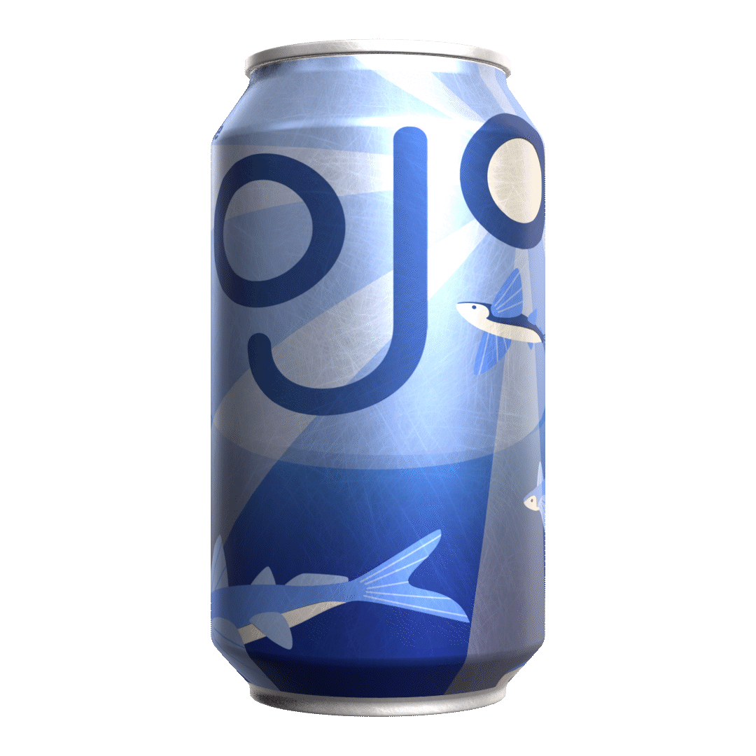
I thought the name “Mojo” would be fitting for an iced coffee brand and would be the type of brand to use a vibrant color palette and eye-catching illustrations on their cans, similar to local IPAs or Arizona tea, but with a more modern/minimalist aesthetic to fit in with the established look for coffee instead of a more detailed/edgy style seen in a lot of beer. I noticed a lot of existing iced coffee cans often have a large logo or brand name on the front whereas the product description is much smaller; often choosing general aesthetic over product clarity.
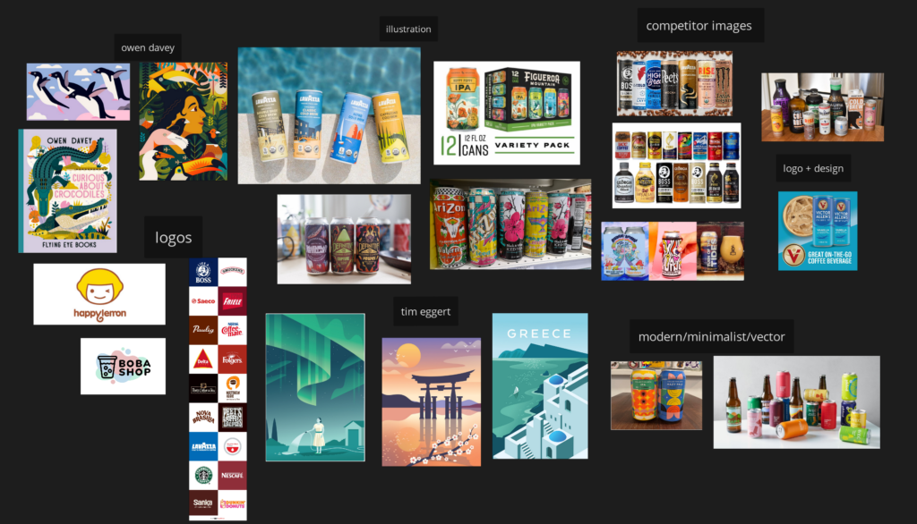
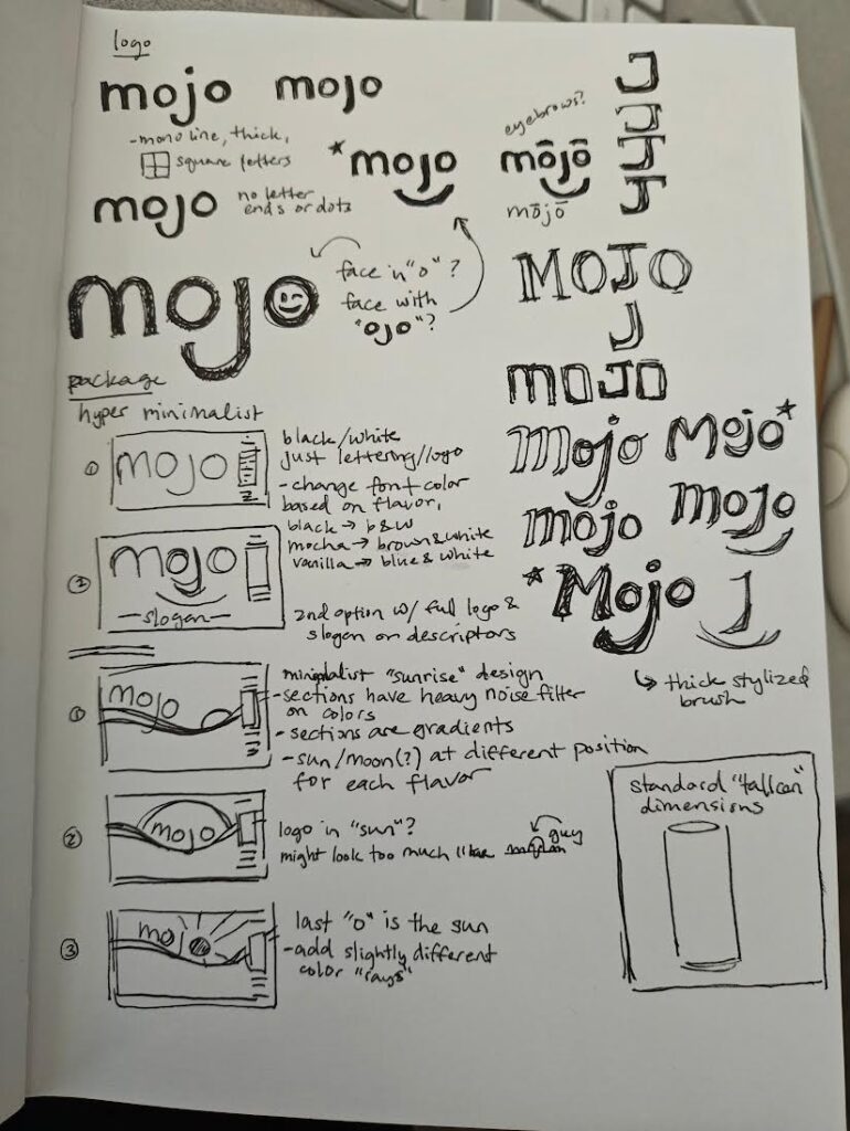
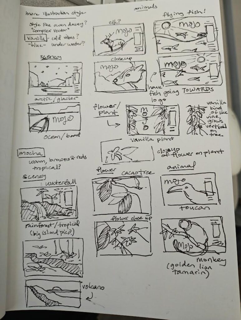
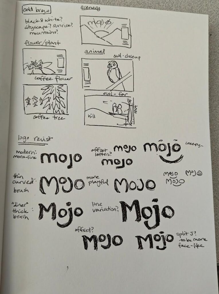
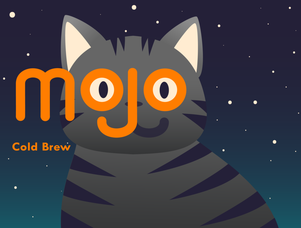
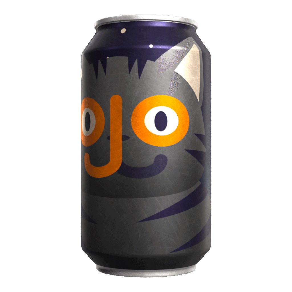
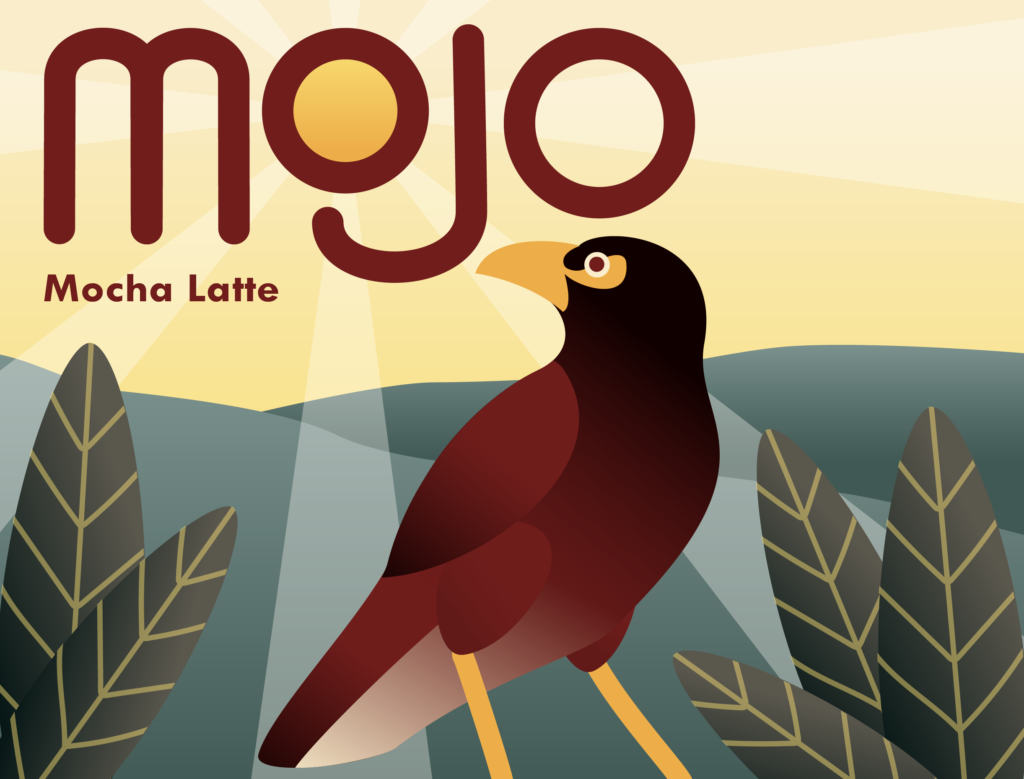
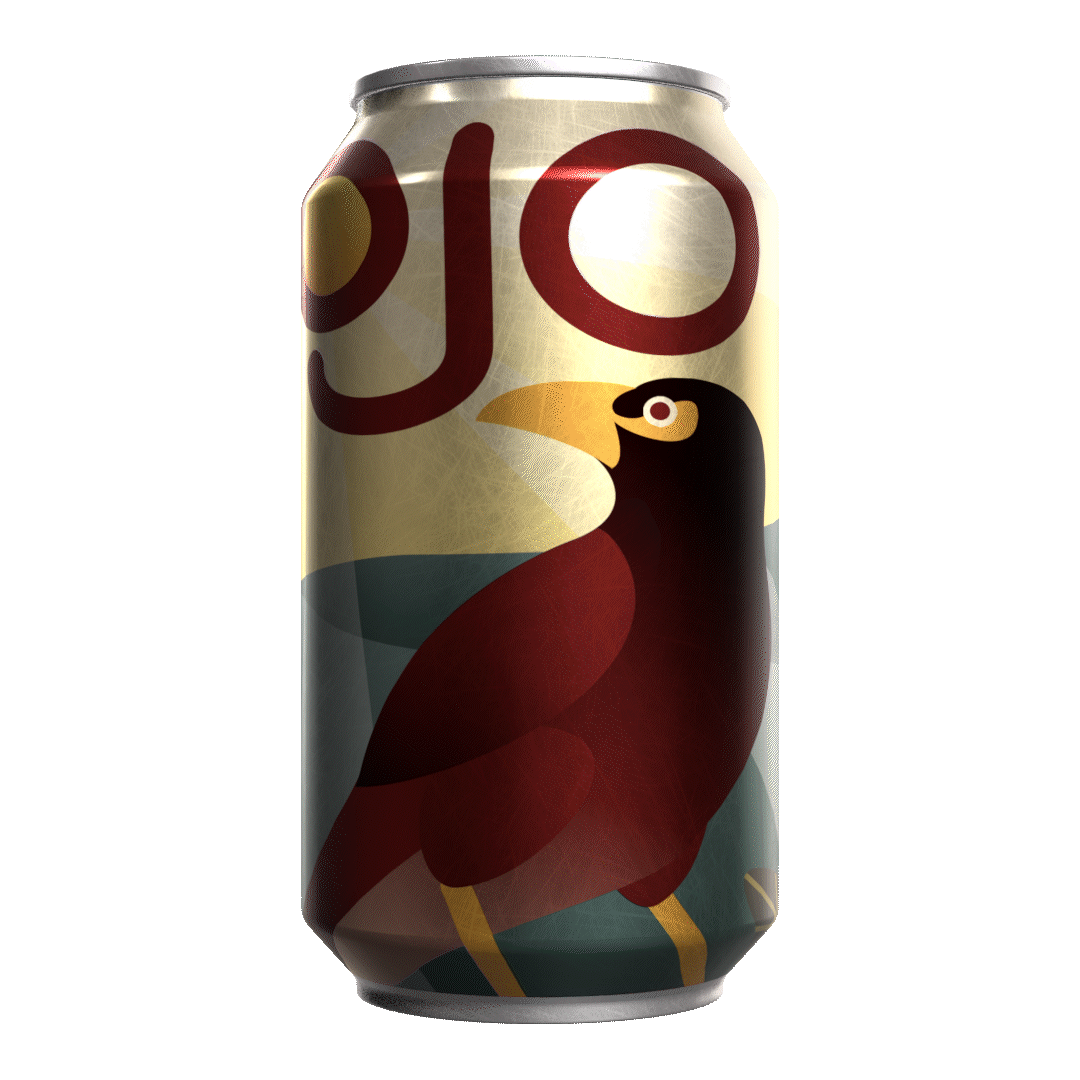
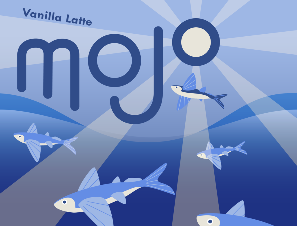
I went through several iterations on different themes for the cans before deciding on going with different animals for each flavor to keep them distinct but still part of a cohesive whole. I chose to go with a vector-based art style to keep the illustrations feeling modern as well as a minimalist rounded sans-serif lettering style for the logo.
The completed illustrations done in Adobe Illustrator and renders made using Substance Painter:

This project was done before I learned 3D modelling myself and how to do my own UV unwrapping, and had been initially intended for a flat, 11oz style coffee can, but at the time I was limited to what free to use 3D assets I could get. Overall, I think this was a successful exploration into the topics I wanted to explore and I learned a lot especially on using Substance Painter and importing Substance files into After Effects.